Reequest Events Website
Project: A new website for Reequest Events.
Location: Warsaw, digital project.
Client: Reequest Events (an internal agency project).
My scope of responsibility: an audit of the existing website, a brief and brand communication strategy, information architecture and UX, content concept and copywriting, content marketing and SEO strategy, development of the visual identity system (graphic motifs and brand language), and creative supervision of graphic design and implementation.
Context and challenge
Reequest Events is an agency with a portfolio of projects for the biggest Polish and international brands, from ORLEN, through Amazon and Lexus, to Huawei and mBank. The existing website did not keep pace with the scale of these projects: it spoke with the voice of a smaller company than the agency really is. The website was meant to become an active sales tool, generating enquiries from large corporate clients and doing the presales work before any conversation takes place.
Creative concept
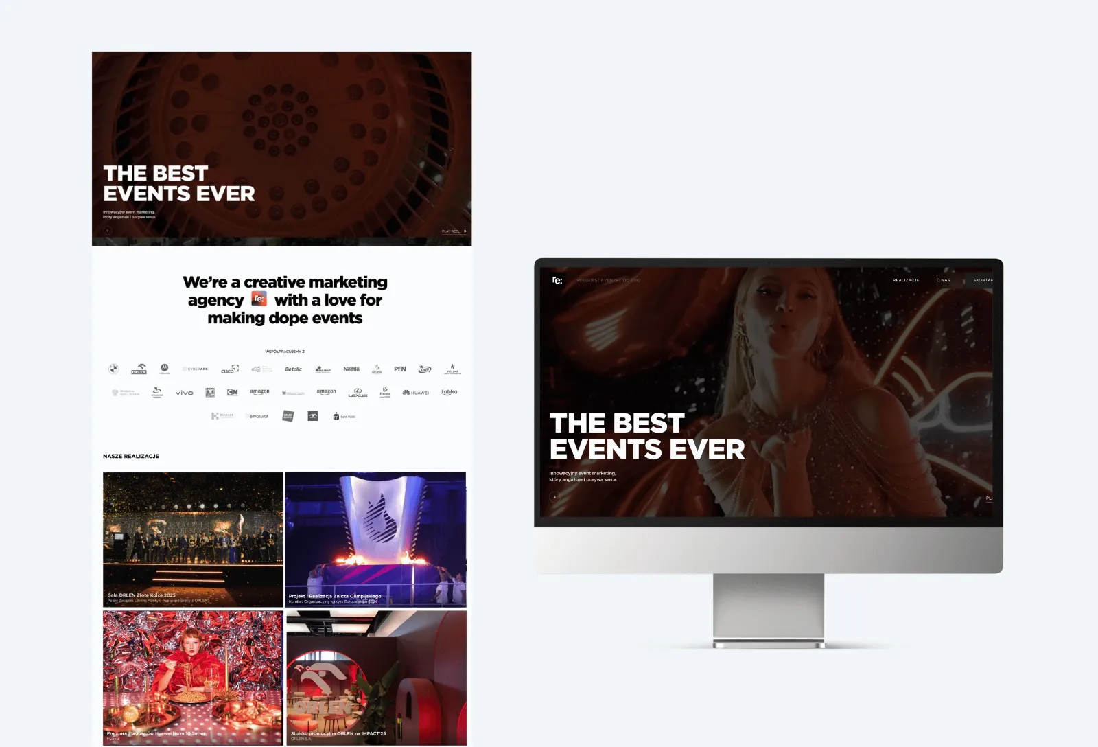
The starting point was a single assumption: the website should work like the agency's best showreel and speak the language of its projects. Less descriptive text, more proof in the form of moving images and client brand names. We chose "The Best Events Ever" as the guiding line, direct and ambitious, placed on the first screen as a declaration, not an invitation to debate.
We designed the website, like the logo, in black and white. The minimalist form deliberately reflects the scale and level of the agency's projects without competing with them visually. Color comes only from event photos and videos, which speak for themselves. The black and white framework acts as a gallery frame for the full-color portfolio content.
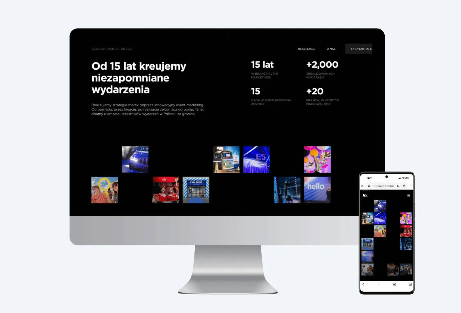
We based the visual identity on three recurring motifs that became the brand's signature in every channel: squares as geometric markers of composition and as frames for shots, the colon developed from the "Re:" mark in the logo, and square patterns as backgrounds for content materials. We designed the "Re:" prefix itself as the brand's linguistic axis. Many Polish words naturally contain it (re:alizujemy, re:lacja, re:ferencje, re:cap), which makes it possible to build distinctive, recognizable messages without artificiality, consistent across the website, social media and printed materials.
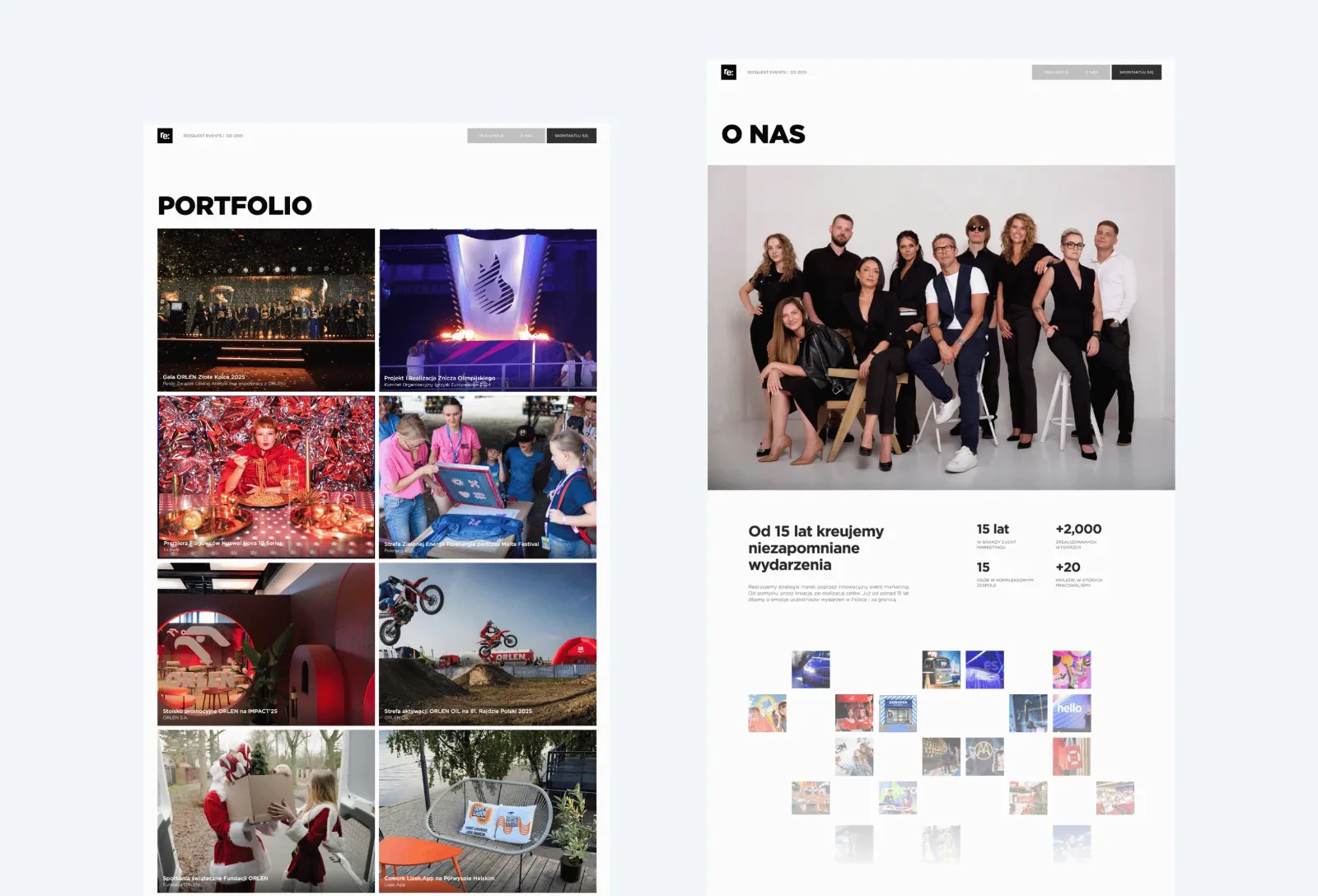
The site architecture was simplified to three main sections: Projects, About us and Contact, so that the user's decision is always a single step. Each project page is treated as a case study, not a photo gallery.
Content strategy and content marketing
I wrote the content from the perspective of an event manager, not a copywriter, giving up industry buzzwords in favor of specifics.
The key content decisions
- A front-page logo wall with client brands as social proof, which works more strongly on a corporate decision-maker than any description of services;
- Clear offer categories instead of one general description: product launches, promotional campaigns, sports events, concerts, team-building events, conferences;
- A projects section as the heart of the site, with dedicated case studies describing specific projects instead of an impersonal photo portfolio;
- Numbers as part of the narrative: years of experience and completed events, displayed on the first screen, not hidden in the footer;
- An SEO strategy based on the phrases B2B clients look for when planning conferences, launches and sports events, with meta descriptions and page titles written for conversion, not only visibility.
Design and supervision
I led the collaboration with the design and development team as creative supervision, from the brief and moodboards, through mockups and prototypes, to frontend testing and launch. The website was built on the Webflow platform.
The most important design decisions
- Video as the dominant element of the first screen, using only footage from real projects, with no stock photos;
- Typography as a tool of hierarchy: large, bold headlines in a Polish-English pairing, set against small supporting text;
- Consistent use of the brand's graphic motifs, meaning squares as a signature in the corners of frames, the colon as a typographic rhythm, and the pattern as a background for content materials;
- Microanimations that keep the pace of an event, not the pace of an ordinary corporate website;
- A project page structure built as a scalable template, ready to be extended with further case studies without developer involvement.
Coordination
I ran the project in parallel with ongoing client projects. Working with the external contractor involved several revision cycles and testing on different devices. The website launched on schedule and, since launch day, has served as clients' main first point of contact with the agency: portfolio, offer and business card in one.
2026, Reequest Events
B2B marketing, Website